Found&
Overview
Found& is a desktop app for curating and discovering various digital media, from visual inspirations and articles, to YouTube videos and audio files.
I was the sole product designer to define and prototype the MVP for Found&. Our primary objective was to build and validate an algorithm-free multimedia social feed driven entirely by human taste and mindful collection.


Organizing scattered sources
Inspiration can come from anywhere. A single project can use a blend of visual references, documentation, videos, articles, and many more. However, capturing diverse media across scattered platforms is difficult to organize centrally and quickly retrieve.
Algorithmic discovery
Loss of context
Without the context of why something was saved, it’s hard to fully utilize the inspiration once the initial insight fades. This lack of context also forces collaborators to clarify the purpose of valuable assets or risk team misalignment, instead of quickly utilizing them.
Jump to solution
↓
Opportunity
While existing tools addressed isolated fragments of the workflow, there were little to none which offered a holistic solution.
We saw an opportunity to build a comprehensive multimedia curation and discovery ecosystem capable of handling everything from PDFs and font files to audio samples and lines of code.
We envisioned a system where a line of code could sit meaningfully beside a graphic design poster, connected by the user's intent rather than file type.
By shifting curation from aesthetics to utility, and replacing algorithms with human taste, we had the chance to create a platform for valuable, organic discovery. This could allow creatives to find unexpected inspiration and resources through a network of tastemakers, breaking them out of their usual bubbles.
Defining the scope
To quickly validate our core concept, we had to scale back on our massive vision of a limitless multimedia ecosystem featuring an infinite-canvas, into a highly focused MVP.
Desktop first
Core Features
Supported Media
We restricted V1 to common media formats such as images, videos, GIFs, links, text, and full-page snapshots to ensure a lean, testable build without sacrificing the multimedia experience.
Solution Design
Here is how I designed the most essential features:
Cards
Card design
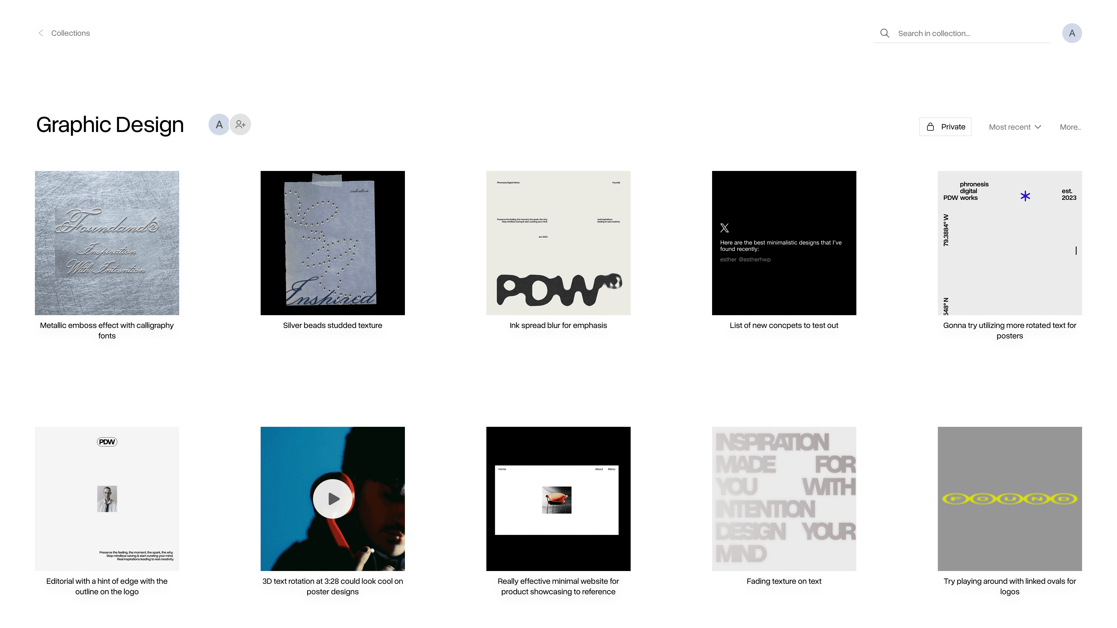
The main challenge was displaying diverse media types of varying sizes and orientations. Instead of displaying them in their respective orientation and sizes, I unified all assets into square thumbnails with the user’s intent displayed underneath. This required a trade-off of not being able to see the uncropped asset at a glance for structural consistency. This established a predictable visual rhythm where users always know exactly where to find the context they are looking for in a sea of varying media.

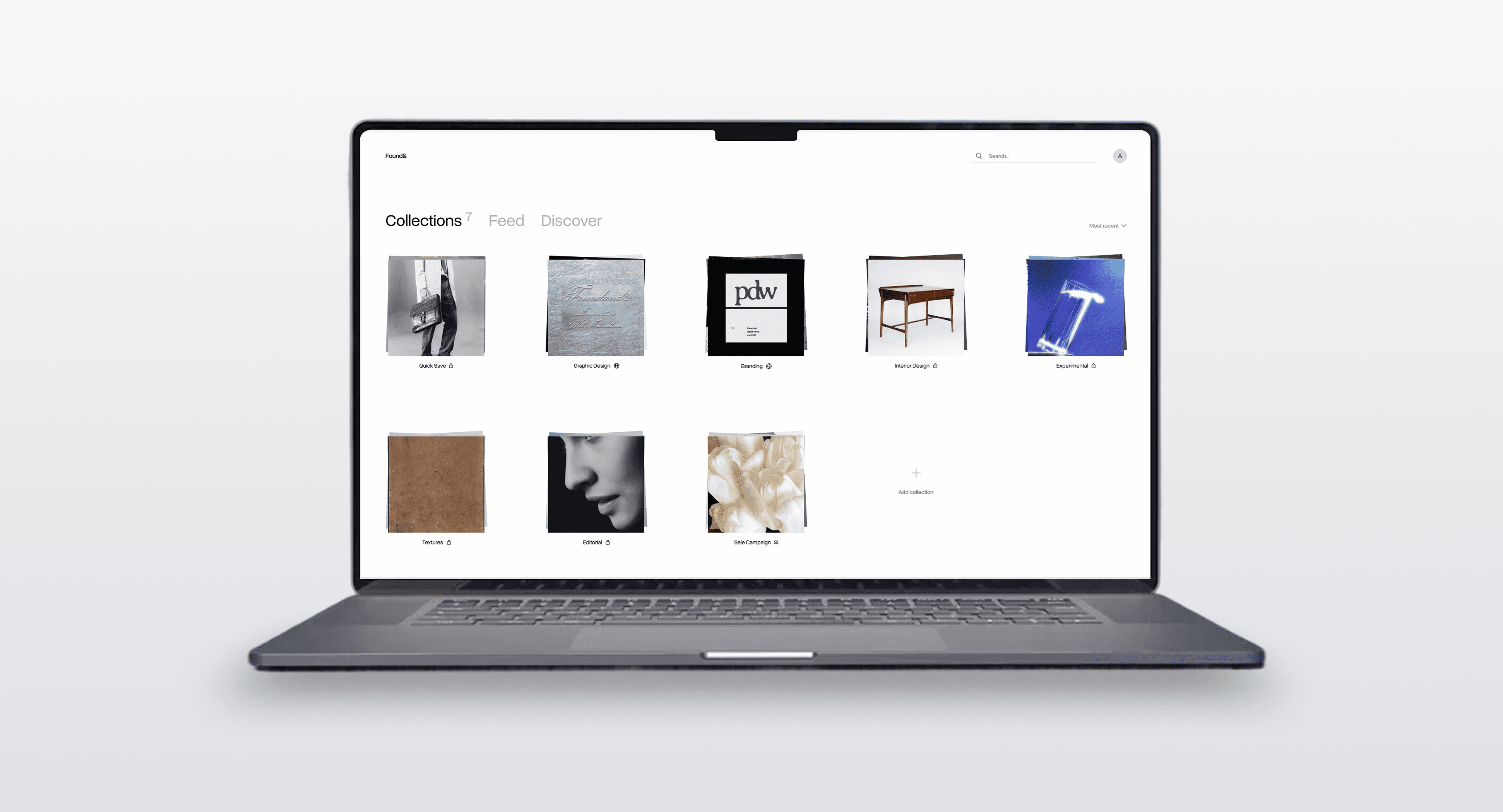
Collections
The cards were organized into a folder system called “Collections”. I used a spacious grid format, giving each card enough room to be isolated during quick scanning. I also introduced a "Quick Save" default collection to capture on-the-go inspiration without forcing immediate categorization.
Expanded view
To solve the trade-off of the cropped thumbnails, I designed an expanded viewer. This viewer displays the asset in its original, uncropped form alongside crucial metadata. Most importantly, it features the source link, making it easy for users to retrace an artifact back to its origin.

Feeds
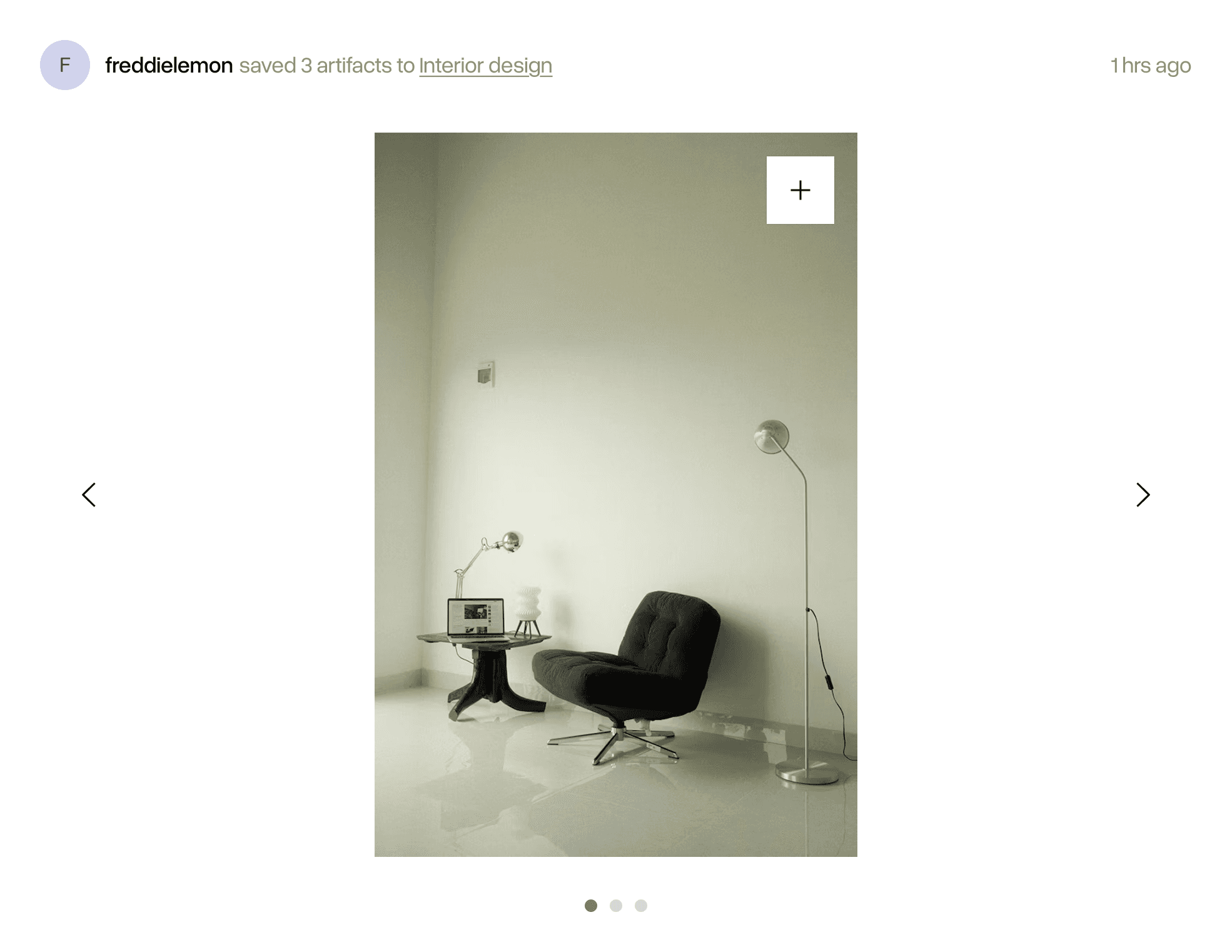
Following feed
This feed was designed to surface artifacts saved by users within an individual’s network, allowing them to discover and adopt artifacts from trusted users. A major challenge was preventing feed fatigue. If someone saved twenty images in a row, it would overwhelm their followers' feeds with twenty posts.
To solve this, we designed a system that groups artifacts into a single post based on what collection they were saved to, and the timeframe of the saves.
Post design
Posts were stripped back to the absolute essentials: who saved the artifact, and what folder it lives in (if it’s public). The only actionable items for a user are hover to save to their own collection or click to see the expanded view of the artifact. I intentionally chose not to implement likes or the number of saves because the focus was to foster a space of utility and creative workflow, not create an environment of social validation or performative curation through metrics.
Discover feed
For an unexpected, organic discovery, I designed an algorithm-free feed that completely randomizes saved artifacts from users outside of an individual’s immediate network.
I utilized the same grid of cards collections use, for quick thumbnail scanning and deep dives via the expanded view. I also added a refresh button to give users agency over when they can get new content, rather than automatically refreshing the page every time they enter it.

Media capture
Context-Aware capture methods
To handle various formats of media seamlessly, I designed a browser extension with multiple entry points.
Global page capture
Clicking on the extension icon saves the entire website link.
It was optimized for popular sites such as X or YouTube, allowing for platform specific formatting (e.g. posts, videos) when saving.
Hover to save
Surfaces a save button over images for quick visual curation.
Right-click on a target
Users can right-click specific elements (e.g. image, GIF, link, and selected text) to save them.
Visual preview
Since webpages can have numerous elements, I added a visual preview into the capture modal to eliminate any uncertainty about what asset is actually being grabbed.
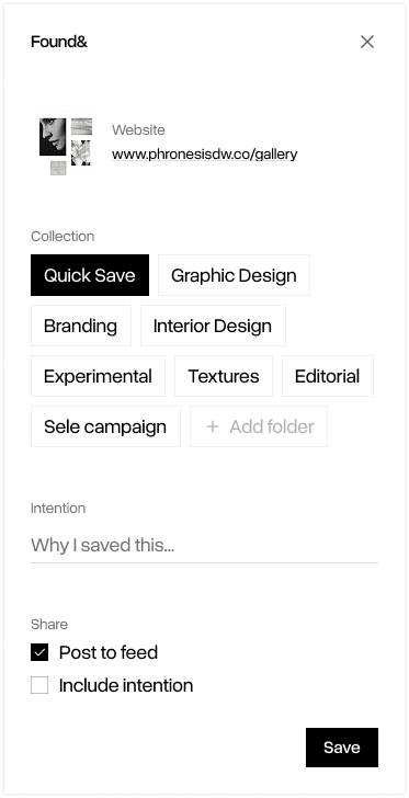
Input fields
I simplified the input fields to the essentials: Collection selection, save intention, and sharing options. While it would align with our goal of mindful curation to make collection selection and writing save intentions compulsory, this could introduce significant frustration and friction. I compromised by making the intention field optional and implementing a smart-default to a ‘Quick Save’ collection.